
Complete guide to Responsive Web Design
🧵👇🏻

In order to make a RWD, you just need to consider one thing.
"Ability of content to fit inside any device that look good and it will be for user to interact with that"
2 / 16
Responsive web design is not a kind of program or framework. We can say it's a combination of various concepts using which we try to make our web page look good on all devices
The great thing is that you can achieve RWD using HTML and CSS only⚡
3 / 16
1️⃣ First and foremost thing in order to make RWD is <meta> viewport element.
It forces page to follow the screen-width of the device.
4 / 16

2️⃣ The second important point to note is that don't use large fixed width or height element.
It can cause trouble. Let's say an element having width 500px but user is viewing on a device having width smaller than 500px
In such cases, use min-width or max-width
5 / 16
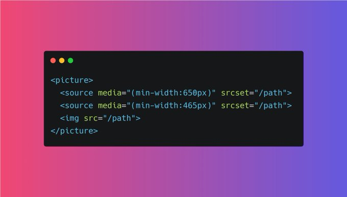
3️⃣ Use HTML <picture> tag
The HTML <picture> element allows you to define different images for different browser window sizes.
6 / 16
4️⃣ Responsive text size
Although you can make text responsive using media queries but you can also use "viewpoet" width as well.
h1 {
  font-size: 10vw;
}
7 / 16
5️⃣ Try to use Layouts
Using Grid or Flex layout always beneficial in order to make a web page responsive. Both these layout are not hard to learn. Try to use them😉
8 / 16
6️⃣ Use box-sizing: border-box
Don't know you consider with point valid or not but small thing can make big impact.
Box-sizing: border-box; forces an element to adjust it's padding and border inside width and height of that element
CONT...👇
9 / 16
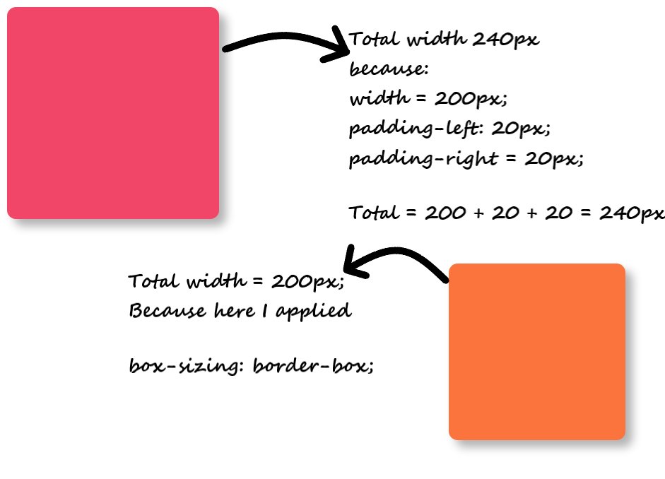
Even small 4px border can damage the responsiveness. Hence I always consider box-sizing border-box for RWD.
10 / 16
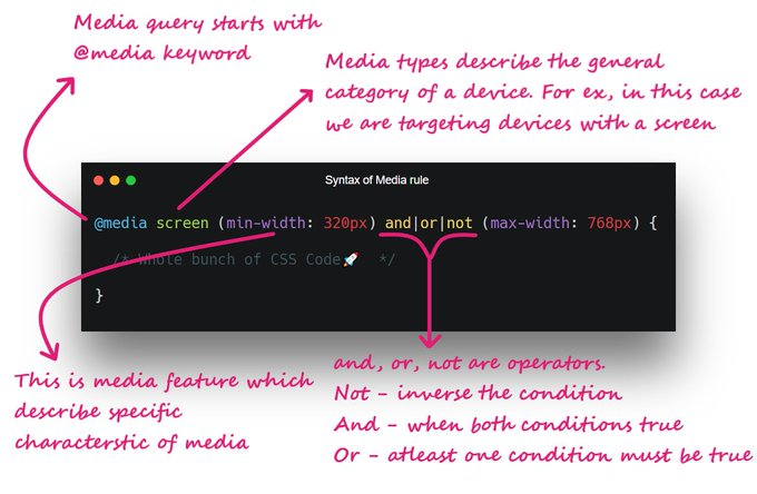
7️⃣ Media Queries are saviour
Media query is a rule to include a block of CSS properties only if a certain condition is true. It is very useful in order to make a RWD.
11 / 16
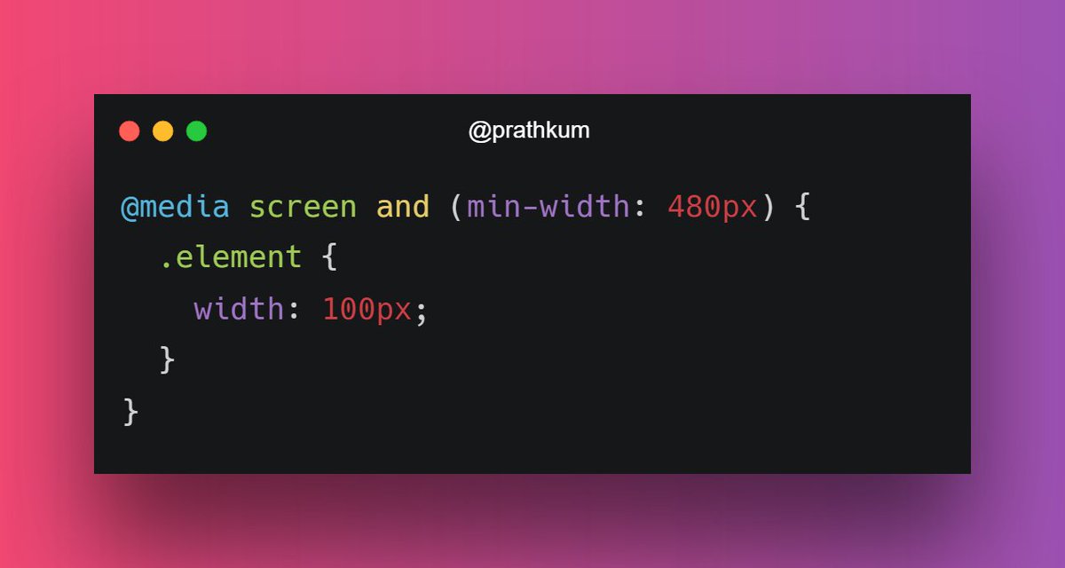
Here is the basic syntax of media query
Check out the detailed thread on media query 🔽
🔗https://twitter.com/Prathkum/status/1363063942994685952?s=20
12 / 16
8️⃣ Use "auto" in media
Almost 99% a web page contains images or videos. And in order to make them responsive, use "auto"
If the width property is set to a percentage and the height is set to "auto", the image will be responsive
13 / 16
In order to improve further, you can use max-width in image so that quality of image will be persist. After all it can also be considered as responsive 😅
14 / 16
9️⃣ Use frameworks if possible
Sometimes it might be a tedious task to handle responsiveness if you're wirting pure CSS. Try to use frameworks because they can save a lot of time designing a responsive website
15 / 16
I think that's pretty much it for this thread. Did I miss something?
Feel free to add your suggestion below and thanks for reading ❤️
I am glad you all are finding this thread helpful💖
Can we take it to 2K likes😉
100% of Profits Are Donated To Research-Backed Charities.